East Coast Pawn
UI Design | Branding | UX | Strategy
Overview
East Coast Pawn is one of Connecticut’s fast growing pawn shops in the area with the plan to expand the more time passes by. ECP has always been involved and in support of their local community, so they wanted to not only rebrand, but to also clean up their digital presence and social media.
East Coast Pawn differs from other pawn shops. When it came to investigating trends and regularities, the ECP system differed from traditional pawnshops’ way of selling, communicating, and speaking to their loyal customers.
Discovery Phase & Challenges
As ECP has opened multiple locations, a clear and clean branding guideline was needed for all locations. Since ECP was associated with traditional pawn shops, people assumed they were outdated and run down. Additionally, some people mistake their newly acquired shops for those owned by the previous owners.
The messaging of ECP has always remained consistent throughout the different phases of our consultation. Along with acquiring additional locations, the previous business within some of the locations was associated with their brand.
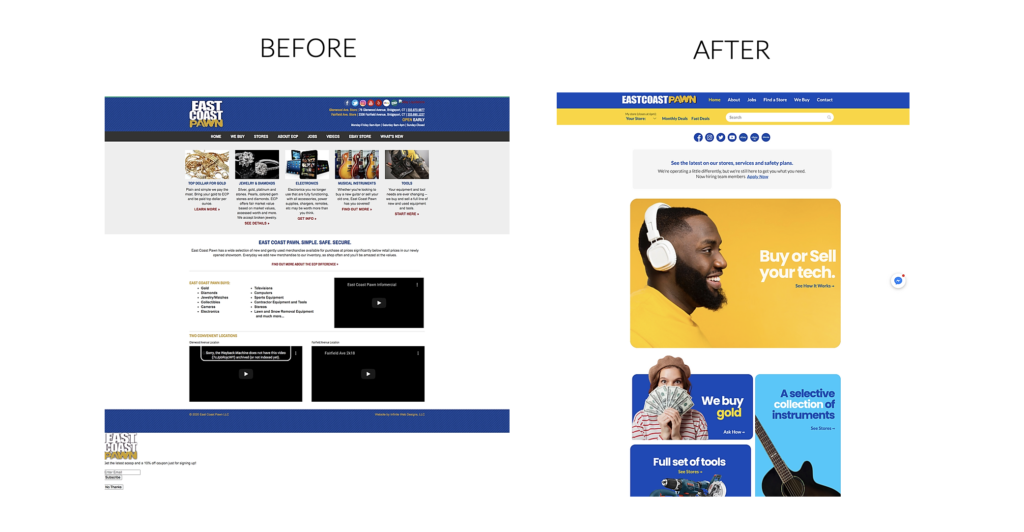
Looking at the data from their previous website, it appears that the users had some trouble and confusion while navigating the customer journey and even obtaining regular information. The site was outdated in terms of its UI and UX, as well as its flow and purpose.
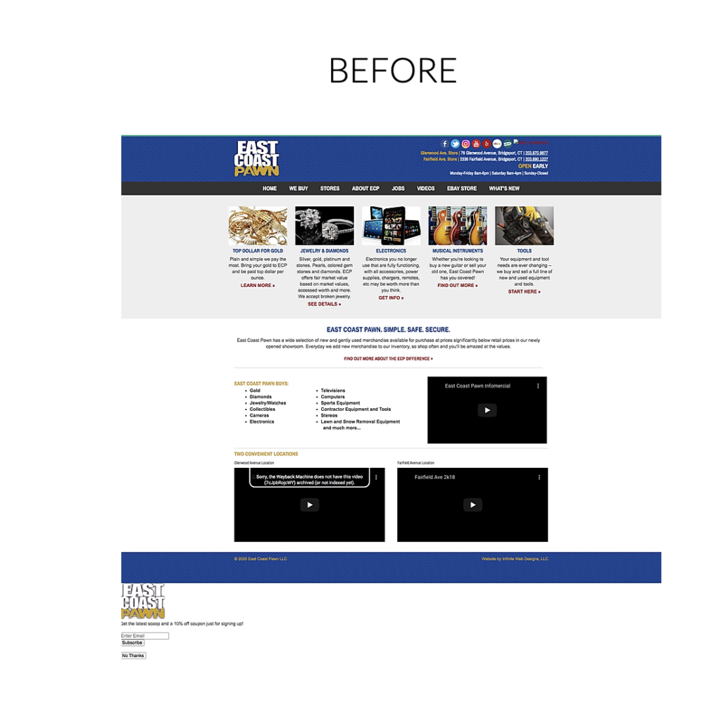
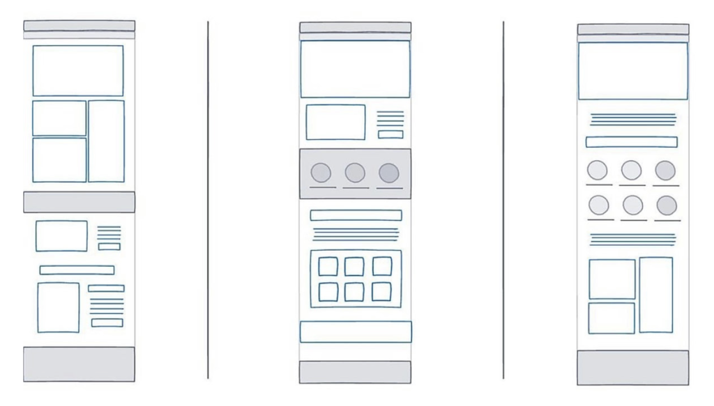
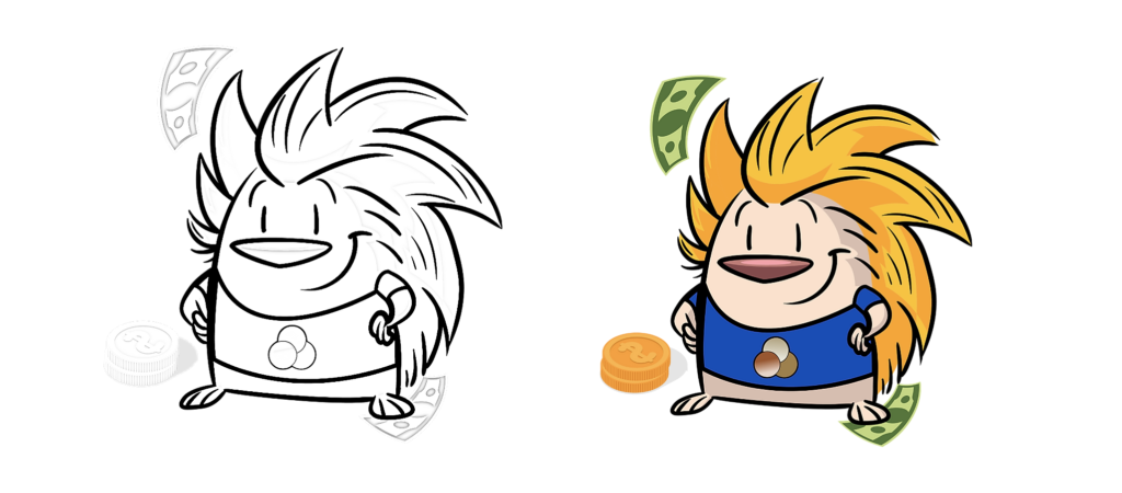
The brand was concerned with coming up with a new website design that would appeal to a younger audience and make it easier for them to interact online. Considering the brand assets and systems at the time were outdated, I developed three different approaches to target the website and the communication systems. Along with a brand-new mascot.
Evolution
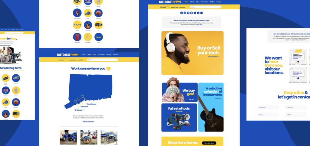
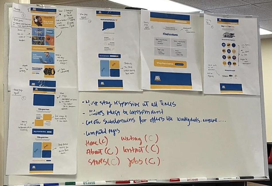
Taking the plan to execution, I began the process of enhancing the user experience on the website. As soon as customers landed on the homepage, there needed to be a way for them to call or chat online. The importance of visual aesthetics has not changed.
Drafting and coming up with a mascot for the brand was another challenge. The mascot not only needed to speak to the staff and be part of them but also it needed to communicate warmness and a welcoming vibes just as the each of the stores once you walk in.
Launch
There’s no doubt the improvement between the old and new UI/UX along with the branding and new strategy for the brand. A new way to present not only the UI voice and tone of their website but also a warming and welcoming way to communicate with customers.
